


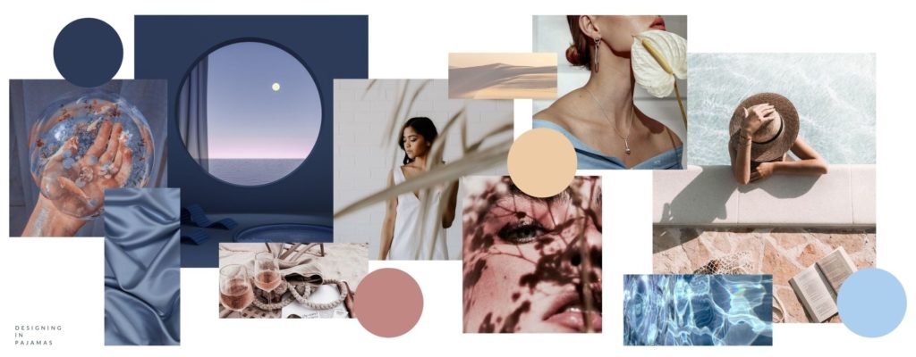
You’re probably here because you are a mindful and conscious business who wants to take their brand to the next level but have no clue on where to start. Building a brand has many aspects that may seem overwhelming but trust me, this simple trick can instantly elevate your brand and align it to your brand voice. One simple aspect — Color psychology. And yes you can grab this customized color palette perfect for mindful businesses in the wellness, beauty and coaching space.
Well, what is color psychology? And why do I have to pay attention to what it is?
Color Psychology is the study of how color impacts the way we perceive a brand. Colors have a powerful effect on our emotions and these emotions play a major role in how we behave as consumers.
Brand color psychology provides a framework for understanding how and why we interact with the brands in our lives. And it is a powerful tool in brand design if you’re considering rebranding.
Understanding how consumers react to certain colors gives you a better idea on how to visually connect your brand to your consumers. Being intentional about how you use those colors helps you deliver your message emotionally and effectively to your audience.
There are four factors you should keep in mind when picking your brand colors:
1. Choose a Color that is Authentic to your Brand
It’s important to choose a color that feels aligned to your industry and authentic to your promise. Make sure that when you pick a color, it reflects the product and service you offer.
This is more important in certain industries than in others, but there’s no easier way to turn off potential customers than to pick a color that feels wildly inappropriate for what you do.
2. Choose a Color That Embodies Your Brand Personality
Your brand personality is how you would describe your brand if it was a person. Your brand personality is the part of your brand that your audience identifies with on a human level. It’s important that your brand touches your audience at an emotional level and one of the best ways to express your brand personality is by utilizing the colors you associate with your brand. Choosing a color that embodies your brand personality is critical to building a consistent and cohesive brand experience.
3. Choose a Color That Appeals to Your Audience
Understanding your target audience is the first step to creating a powerful brand. This is especially true when picking the right color for your brand. Always consider your ideal client in whatever step you are doing in your brand. What color is going to resonate with your ideal client the most? Whether it is masculine vs. feminine, classic vs. funky, or modern vs. traditional, your target audience’s defining traits should align with those of your brand color.
4. Choose a Color That Differentiates Your Brand
Another important aspect to consider for choosing your brand color is differentiation. While it is isn’t important to choose a color that none of your competitors are using, it can go a long way toward setting your brand apart from the market. Be intentional with the colors you choose and set yourself apart from the pack by picking a color that can emotionally relate your ideal client to your brand and not your competitor.
It’s important to do a brand audit to know if you are hitting these 4 important aspects in your brand. Once you get a clearer picture on the aspects in your brand that needs refining, you are ready to utilize the power of color.
The Psychology of Colors in Branding
One cannot deny the power of a memorable brand. The first interaction we make in any product or service is the visuals — they way it looks. This means it’s color, shape and distinct factors. More often than not, our decision to purchase a product or service is greatly affected by this first impression. Humans are emotional beings and 8 out of 10 chances, a person tends to buy using their emotions. By knowing the psychological associations of the most commonly used colors in branding and marketing, you can strategically plan how a consumer perceives your product or service.
I’ve listed 6 of the most commonly used colors, along with the brand color psychology guidelines of each.
Remember, none of these emotional responses are objectively fixed to any given color. When it comes to color psychology in branding, context and culture matter. This is why knowing your target audience and their behavior greatly affects the decisions you make when developing your brand positioning and personality. With all of the information ready to back you up, choosing the right color for your brand can be a rational, informed decision.
Red
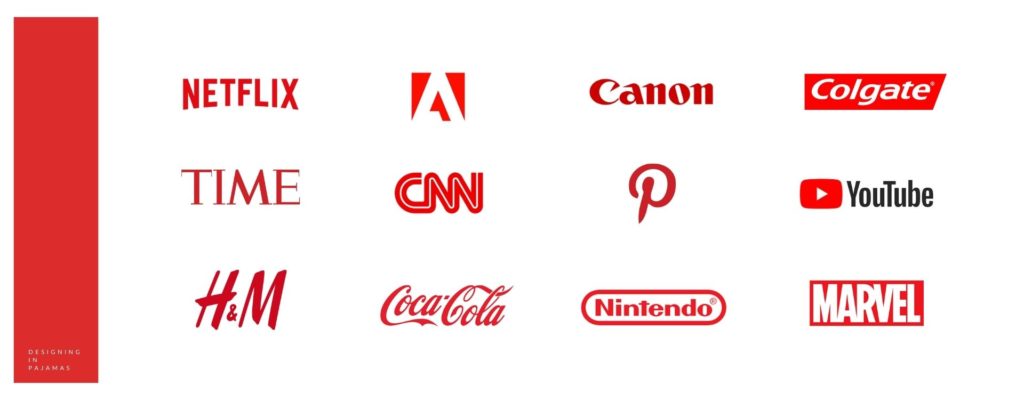
Red’s effects on the psyche are not subtle. It’s therefore important that it be used carefully for branding purposes. Red has been shown to reduce analytical thinking—it speeds up and intensifies our reactions. There’s a reason why clearance sale prices are put on red tags.
Red has the longest wavelength of all the colors, and so appears to be nearer than it actually is. It is the color of passion and romance. Red tends to increase the appetite and is used in a range of colorful terms centered on excitement.
Blue
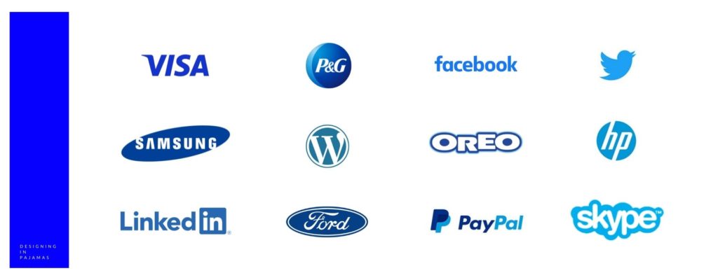
Blue evokes the mind. Serene and calming, it is the color of clarity and communication. According to brand color psychology studies, blue is the most common favorite color among the world’s population and is particularly preferred by men. It is, of course, everywhere in our daily lives. It’s the color of the sky, the oceans, and the lakes.
This global preference and environmental omnipresence make blue non-threatening, conservative, and traditional. Brands are not taking any risks when they call on a shade of blue for their identity. It is seen as a sign of stability and reliability, and it’s been shown that workers are more productive in blue rooms.
Blue, of course, is also the color of sadness and coldness. It is among the least appetizing of colors as it is an indicator of spoilage and poison. Weight loss plans suggest you eat food off a blue plate as you’re liable to eat less of it.
Yellow
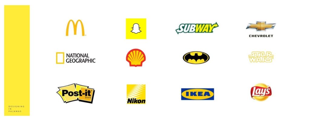
Yellow seems to have the smallest fan club of all the colors, but those who do like it are passionate about their preference. It is widely considered a cheerful hue, but too much yellow can also trigger feelings of anger, frustration, fear, and anxiety. This is because it’s the most difficult color to take in. It’s enough to make babies cry in some studies.
Yellow has been shown to increase metabolism, and can lift self-esteem when utilized correctly. Because it has a relatively long wavelength, it is the most visible color; it’s stimulating and attention-grabbing. Traffic signs, advertisements, legal pads, and certain warning labels take advantage of this fact.
Green
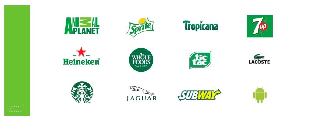
green is the easiest on our eyes because it requires no adjustment when it hits the retina. It is therefore calming, restful, and pleasing. Performers waiting to go on stage or television wait in “green rooms” to relax. Green can actually improve vision, and is used in night vision because our eyes can discern the most shades of it.
Sitting comfortably in the middle of the spectrum, green is the color of balance. It represents nature, fertility, and even sexuality. The myth of the green M&M is an enduring one. A green world is a safe world, one that is lush, full of water, and life-giving. For this reason it’s a reassuring color often used in healthcare. Like all colors, though, green has its negative side. It is at once the symbol of health and sickness, luck and jealousy.
Orange
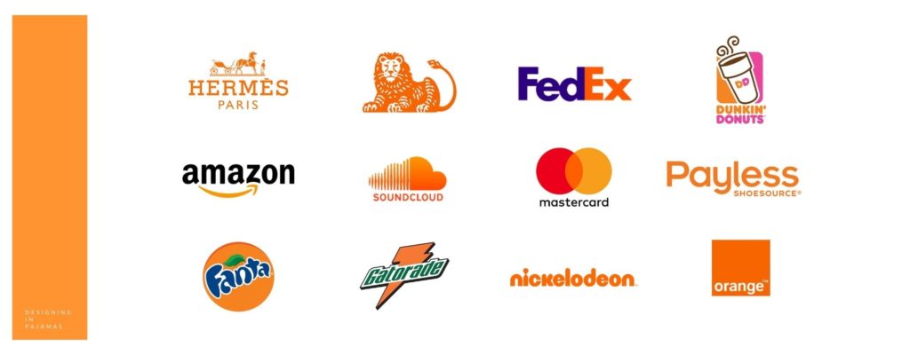
At the crossroads of red and yellow sits orange. Orange is stimulatory, conjuring feelings of excitement, enthusiasm, and warmth. It is a fun, energetic hue found in the branding of many sports teams.
Not unlike red or yellow, orange is used to draw attention—in traffic cones and advertising collateral. Research shows that consumers tend to associate orange with value, a fact that brands like Home Depot have capitalized on.
On the physical end of the spectrum orange evokes comfort like food, warmth, and shelter. It is the color of sunset, citrus, and pumpkins, forever linked to fall and Halloween for American customers. This is especially the case when it is paired with black, which lends it a tone of cartoonish dread and frivolity.
Purple
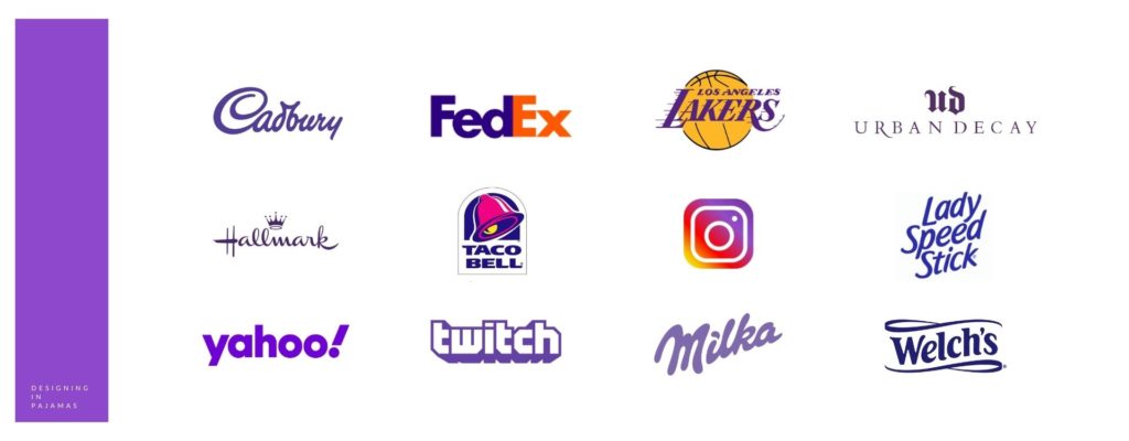
At the intersection of red and blue, purple is an intriguing balance of masculine and feminine traits—at once warm and cool, yet neither. This melding of blue’s calmness and red’s stimulation can be unnerving unless the dominance of one or the other is clear. Blueish purple, then, is patently cool, while reddish purple is patently warm.
Purple is the color of royalty and bravery, and connotes wealth, luxury, and sophistication. It is among the rarest colors in nature and as such can come across as either special or artificial.
Purple sits in the shortest wavelength and is the last to be visible. For this reason, it is associated with time, space, and the cosmos. It’s imbued with spirituality, contemplation, and mediation, suggesting creativity and imagination.
The Takeaway
Colors strongly influence how the world perceives your company. It is one of the most essential components of visual identity. Each and every color impacts your target audience differently. Choosing a color that is authentic to your brand, embodies your brand personality, appeals to your audience, and effectively communicates your message visually is one of the best ways to elevate your brand. Be intentional with what color you use in your brand.
BONUS: If you are a mindful brand, we’ve created a custom color palette perfect for you. Snatch it while it’s hot!
Content reference: Ignyte Brands